Billets récents
Nuage de tagsécrit élections été 2d 3D 16/9e 17mars 30anscanal abstrait Alain de Pouzilhac allemagne animation arte autopromo bandes-annonces bbc bfmtv canal+ Christine Ockrent christophe valdejo cinéma club des da couleur danemark devilfish dixonbaxi dream on elections etats-unis etienne robial europe eurosport exposition flat design france 2 france 3 france 4 france 5 franceinfo francetv Gédéon grèce habillage haute définition identité visuelle idents imprévu inédit info italie jeux olympiques jingles pub journal jt lancement lci les demoiselles live action logo météo m6 manvsmachine Marie-Christine Saragosse marketing matt pyke minimaliste motiondesign motionfanclub motion palace movement municipales noel noel14 orange origami podcast politique pop présidentielle 2017 présidentielle 2022 promax promaxeurope2015 promis récompense ramon & pedro rencontre rouge royaume-uni ruedi baur sport stratégie suisse télécréateurs teaser tf1 timelapse TV5 Monde typo view water nyc
Catégoriessrc="http://pagead2.googlesyndication.com/pagead/show_ads.js"> ArchivesRecherche rapideNOUS CONTACTEREnvoyez-nous un email sur
contact[at]lenodal.com |
Lundi, 12 septembre 2011L'habillage de la coupe du monde de rugby 2011
Ce vendredi 9 septembre a marqué le coup d’envoi du plus grand événement de la planète rugby : la Coupe du monde. Diffusé dans près de 200 pays, il bénéficie comme toutes les grandes compétitions sportives d'un habillage spécifique. Découverte de son univers graphique et sonore.
Cet habillage international, repris par l'ensemble des diffuseurs, est signé par l’agence néo-zélandaise Brandspank. L'agence a déjà travaillé pour la chaîne Sky, diffuseur hôte de cette Coupe du monde. Les génériques, qui encadrent les retransmissions, mettent en scène des symboles du rugby : un joueur en action, le stade de l’Eden Park d’Auckland et la coupe Webb Ellis, trophée qui sera remis aux vainqueurs. Le visuel s'accompagne d’une musique solennelle, basée sur « World In Union », l'hymne de la Coupe du monde de rugby interprété par Hayley Westenra. 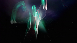 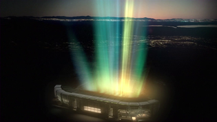 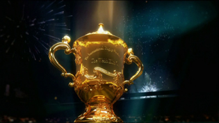 
Pendant les matchs, les synthés affichent une prédominance de bleu, couleur traditionnellement utilisée à chaque Coupe du monde de rugby avec le vert. Il s’agit là d’un package graphique dans la tradition de ce que propose la Nouvelle Zélande en matière de rugby, avec une utilisation parfois différente de que nous connaissons en Europe (notamment pour l'ordre d'apparition des informations à l'écran). 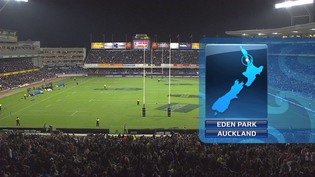 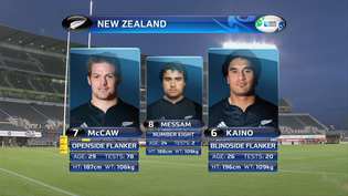 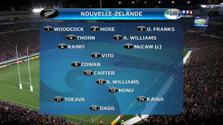 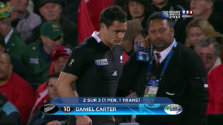
Sur TF1, quelques éléments spécifiques ont été produits, comme l'affiche du match à venir ou le générique du « Mag ». 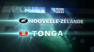 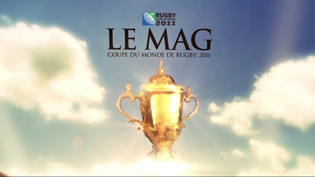
Pour mémoire, c’est l’agence Télévision qui avait produit pour l’international et pour TF1 (alors diffuseur hôte) l’habillage de la Coupe du monde de rugby 2007. 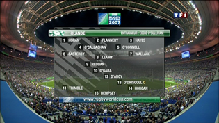  Exemples d'éléments de l'habillage de 2007 Mardi, 23 août 2011En attendant la Coupe du monde de rugby (maj)
Du 9 septembre au 23 octobre, la Coupe du monde de rugby occupera les antennes de TF1, France télévisions, Canal+ et Eurosport. En attendant le coup d’envoi du match d’ouverture, les chaînes dégainent leurs teasers et bandes-annonces avec des approches différentes. Tour d'horizon des premières campagnes d'autopromotion.
 Sur TF1, les premiers teasers mettent principalement l’accent sur le caractère événementiel de la compétition. L'un d'entre eux met en scène le ballon officiel de la Coupe du monde envahissant les plus grandes cités du monde : de New York à Sydney, en passant par Rome et Paris, « le ballon ovale envahit la planète », sur fond de haka néo-zélandais. Le packshot insiste sur le caractère premium de la diffusion. Sur TF1, les premiers teasers mettent principalement l’accent sur le caractère événementiel de la compétition. L'un d'entre eux met en scène le ballon officiel de la Coupe du monde envahissant les plus grandes cités du monde : de New York à Sydney, en passant par Rome et Paris, « le ballon ovale envahit la planète », sur fond de haka néo-zélandais. Le packshot insiste sur le caractère premium de la diffusion. 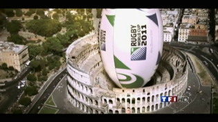 Dans le deuxième teaser, des images de l’édition précédente mettent en avant les actions sportives ; phases de jeu, passes et essais donnent un avant goût du spectacle à venir. Mais il rappelle aussi que la diffusion ne concernera que le « meilleur ». En effet, TF1 diffusera en direct et en exclusivité 20 rencontres, dont les matches du XV de France (à l’exception de France - Tonga) ainsi que deux quarts de finales, puis tous les matches jusqu’à la finale. 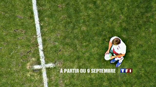 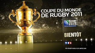 Le troisième teaser, lui, utilise un ton plus décalé. Damien Traille et Dimitri Yachvili sont soumis à un test de photos chez un psychologue. Mais pour eux, un bol évoque un stade, un carré la forme ovale et une série de pingouins les All Blacks. Ces deux-là sont définitivement faits pour le rugby ! Ici, la promotion est centrée sur l'équipe XV de France, pilier du dispositif de TF1. 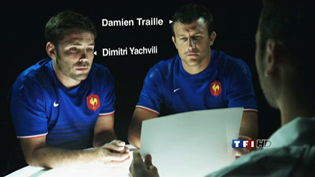 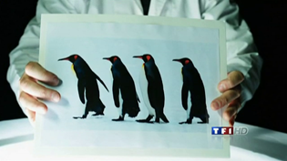
Par ailleurs, on notera l’emploi de la police de caractères officielle de la Coupe du monde, dénommée tout simplement « RWC » (pour « Rugby World Cup »). Conçue spécialement pour l’IRB, elle existe en quatre graisses : light, regular, bold et heavy.
 Chez France 2, les commentateurs se prennent pour des men in black. Mathieu Lartot, Laurent Belet, Cédric Beaudou, Philippe Lafon, Raphaël Ibañez, Jérôme Cazalbou et Fabien Galthié enfilent le costume noir et nous proposent des séquences décalées, parodiant les séries policières américaines. Chez France 2, les commentateurs se prennent pour des men in black. Mathieu Lartot, Laurent Belet, Cédric Beaudou, Philippe Lafon, Raphaël Ibañez, Jérôme Cazalbou et Fabien Galthié enfilent le costume noir et nous proposent des séquences décalées, parodiant les séries policières américaines.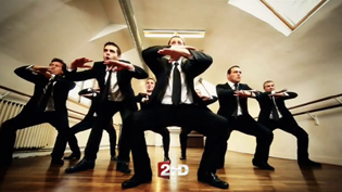  Dans cette bande-annonce pour le match préparatoire contre l’Irlande (vidéo 2 ci-dessous), Cédric Beaudou et ses acolytes analysent un protège-dents rempli de trèfle. On notera l’attirail d’investigation composé d’une pince à épiler, une loupe et un masque de plongée. Les Experts n’ont qu’à bien se tenir ! Une autopromo dans la lignée de ce que propose France 2 habituellement pour le rugby, mêlant séquence parodiques et images d’archives. Elle n'est pas sans rappeler les parodies d’Avatar lors du Tournoi des VI nations 2010. Le groupe public diffusera en direct sur France 2 et France 3 les 28 rencontres rétrocédées par TF1.
France 3 joue aussi sur un ton décalé avec une accroche qui guide la réalisation du teaser : "30 secondes de calme avant 45 jours de tempête". Le graphisme est sobre et épuré : fond blanc, typo grise et visuels noir et blanc en mouvements... 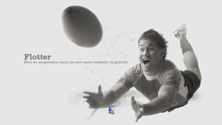 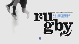
 Un poisson noir, un chien noir, un bébé vêtu de noir, mais aussi un tatouage maori, des kiwis, des moutons… la caméra du teaser de Canal+ explore la maison d’une famille qui semble s’être mise à l’heure des All Blacks. Tous les emblèmes de la Nouvelle-Zélande, à l’exception de la fougère, sont passés en revue dans cette séquence originale. Un poisson noir, un chien noir, un bébé vêtu de noir, mais aussi un tatouage maori, des kiwis, des moutons… la caméra du teaser de Canal+ explore la maison d’une famille qui semble s’être mise à l’heure des All Blacks. Tous les emblèmes de la Nouvelle-Zélande, à l’exception de la fougère, sont passés en revue dans cette séquence originale.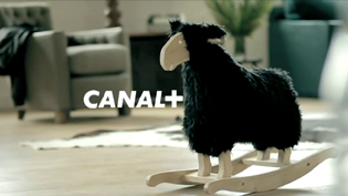 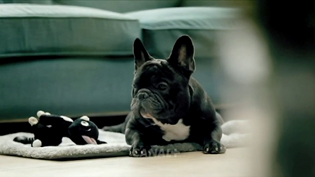 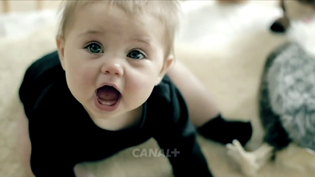 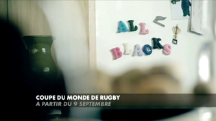 Olivier Schaack, directeur artistique de Canal+ explique pour lenodal : « Notre campagne est une idée interne, proposée par un de nos créatifs sport, Vincent Staropoli. Nous en avons confié la production et la co-réalisation à 24 25 production, avec lesquels nous avions déjà fait les campagnes poker et OM-PSG par le passé. » La chaîne cryptée joue une nouvelle fois le décalage de ton et l'effet de surprise avec ce teaser qui ne montre aucune image de rugby et n'en parle que dans les dernières secondes en signature. Canal+ diffusera l’intégralité des rencontres, dont 28 en direct.
 Sur Eurosport, les All Blacks sont à l’honneur dans un teaser rappelant que le pays organisateur n'a pas gagné le trophée mondial depuis 1987. Les couleurs sont totalement désaturées, y compris l’animation d’ouverture qui est habituellement aux couleurs d’Eurosport. Le noir est omniprésent à l’écran. Pas de voix-off, seul le haka est présent, tant sur le plan sonore que visuel. Sur Eurosport, les All Blacks sont à l’honneur dans un teaser rappelant que le pays organisateur n'a pas gagné le trophée mondial depuis 1987. Les couleurs sont totalement désaturées, y compris l’animation d’ouverture qui est habituellement aux couleurs d’Eurosport. Le noir est omniprésent à l’écran. Pas de voix-off, seul le haka est présent, tant sur le plan sonore que visuel.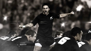  Eurosport diffusera l’intégralité des rencontres en différé et proposera quotidiennement un talk.
[mis à jour le 26/08/11 : ajout du teaser de France 3] Lundi, 11 août 2008Habillages olympiques
À l'occasion des jeux olympiques de Pékin, les chaînes se mettent aux couleurs de l'évènement avec des habillages spéciaux. Voici un premier récapitulatif !
Depuis quelques semaines, les principaux diffuseurs en France nous ont mis en bouche avec des émissions quotidiennes (En route pour Pékin sur Canal+ Sport, flashs spéciaux sur Eurosport), différents teasers (France Télévisions) et des bandes-annonces présentant leurs dispositifs respectifs. L'occasion de découvrir le style créé par chaque chaîne.
Si le lancement officiel des JO a eu lieu vendredi à 8h08 du soir, les épreuves avaient déjà commencé dès mercredi avec les tournois de football retransmis sur Canal+ Sport et Eurosport, et jeudi sur France 4. EUROSPORT La chaîne assure une retransmission 24h/24 avec, chaque jour, 15 heures de live et 9 heures de différé. L'habillage antenne est ainsi entièrement aux couleurs des JO, avec des anneaux 3D faits de faisceaux colorés qui se déclinent sur les jingles, coming-nexts et génériques avec le slogan "Sans limite".  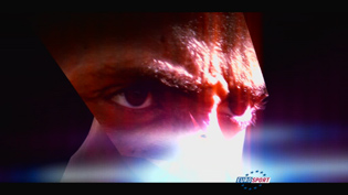 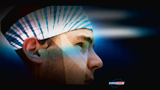 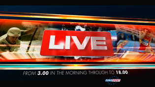
FRANCE TELEVISIONS C'est un générique très corporate qui nous est proposé, déclinant l'identité visuelle du groupe rafraichie en avril dernier. Après une ouverture sur le logo du groupe, les traditionnelles 5 bandes de couleurs évoluent pour nous faire découvrir des images des épreuves et le stade "nid d'oiseau" reconstitué en 3D. Comme pour le Tour de France, le visuel est accompagné par la musique réorchestrée de Maïdi Roth.
CANAL+ Pour l'occasion, Canal+ a créé un logo spécial : le mot "Canal" est traduit en Chinois alors que le "+" est conservé dans sa forme d'origine.  Les génériques sont intégrés à l'habillage global de la chaîne et restent assez classiques, en comparaison des créations pour les précédents JO. Quelques élements ont bien sûr été ajoutés, comme les anneaux olympiques qui apparaissent pendant la première moitié des génériques, ou modifiés comme les trois notes de xylophone marquant la signature sonore de Canal+ en fin de générique, avec une couleur plus "pékinoise". Pour la quotidienne Beijing soir, il faut noter la diffusion surprenante de deux génériques début à la suite : d'abord le "corporate" à l'image de la chaîne, puis une animation plus conventionnelle (ou moderne selon les goûts) avec 3D et incrustation d'image de sportifs où seule l'utilisation de la typo de la chaîne rappelle qu'on est bien sur Canal+.
CANAL+ SPORT Les génériques s'intègrent également à l'habillage et ses formes arrondies vertes caractéristiques (les "patates").
Du côté de la diffusion des épreuves, le BOB (Beijing Olympic Broadcasting, organisme chargé de la production des signaux internationaux) propose un habillage proche de ce qu'on a pu voir à Turin en 2006. Les synthés ont la même structure : cartouche principal aux coins arrondis et incliné vers la droite ; le fond bleu est désormais composé de motif chinois. Les polices de caractères ont par contre été modifiées : le Bell Gothic du titre principal cède sa place à du Myriad Semibold compressé en largeur ; l'Univers et l'Helvetica Condensed des informations secondaires sont remplacés par de l'Arial Bold, également compressé en largeur : 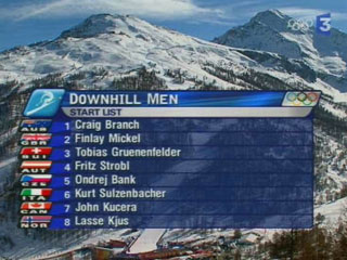 Turin 2006 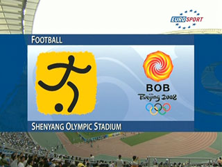 Introduction 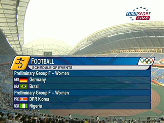 Événements à venir 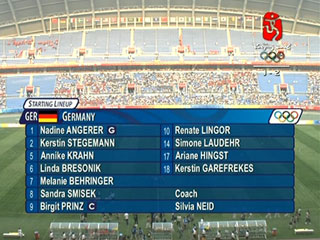 Composition 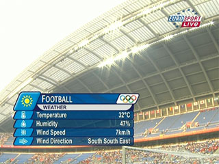 Météo Le replay wipe (transition pour les ralentis) reste inchangé : les anneaux olympiques en 3D balayent l'écran de gauche à droite avec un effet lumineux : 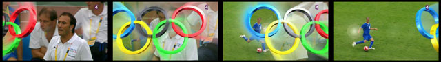
> Toutes nos dernières vidéos sur MEDIAS.lenodal.com |